Introduction
Finacast is a financial planning application that keep track of your cash flow, expenses and help you plan for your retirement through savings goal creation and future simulations of your assets. Finacast also connects you with Financial Advisor so you have access to professional advice and keeps you updated on your overall financial health through smart Reports.
In a few simple steps, you get a financial forecast of your overall net worth using your savings and credit card information, goals, debts, and your ability to meet your budget, goals, and debt commitments. You could simulate life under different scenarios to see how your life would change if you got a raise, had another baby, take your dream vacation, etc. Best of all, you can save as many scenarios as you want. The new application is being built on Salesforce.
My Role
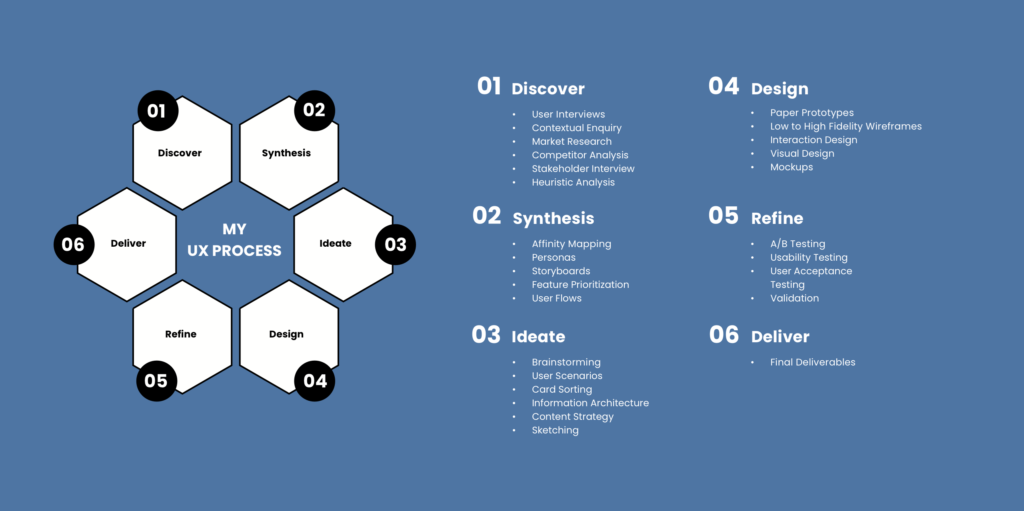
I worked as a lead UX/UI designer who interfaced with the client, conducted UX research, gathered insights from the users and stakeholders, worked on information architecture, wireframes, and visual design for the entire application. The design phase of this project spanned over 6 months yielding a great learning experience and a meaningful application for the stakeholders and the users.
Understanding the Problem
The initial version of the Finacast application was made with Java without considering the user needs. It was pure functional application which is cumbersome with too many things scattered around without a proper information architecture. Considering the latest evolution of user experience in recent time, the application is due a revamp with latest usability principles and visual standards. The new application is being built on Salesforce.
My initial interaction was with clients and stakeholders to understand any pain points that they may have with the existing application.
Jumpstarting Research
User Interviews
I prepared the script for the user interviews sessions. I started the user interviews with stakeholders and then moved on to the potential users (financial advisors and normal users) of the application.
The main goals of the user interviews are to:
— Understand the user goals and business goals.
— Understand any pain points the users are having with the existing application.
— Find out about any new features that users or advisors might need based on current trends.
— Find out how users and advisors use financial applications in their daily lives.
Competitor Analysis
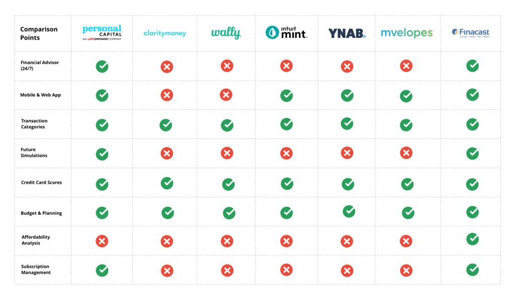
Finance tracking app landscape is so huge that there are so many well-established players in the market. It was important for Finacast to position itself among those players with a concrete differentiator. We began analyzing the competitors in the domain to understand what they are doing in the field, about their services and key differentiators. The main applications that are direct or indirect competitors for Finacast are Personal Capital, Clarity Money, Wally, Mint, YNAB and Envelope. I have analyzed these applications from various point of views such as features, services and their offering. Competitor analysis provided many useful insights into financial habits and usage patterns of the people, and how the companies are performing which reaffirmed the need for such application.
I have complied a detailed list with comparison points between those companies and Finacast as you can see below.
Research Synthesis
Affinity Mapping
After the user interviews, I gathered all the information and began analyzing it, and tried to form trends using affinity mapping.
The main trends that I identified during the process are:
— Information and data users want to see.
— Features for the applications.
— User Behavior (advisors and advisors).
— Issues with the existing application.
— Security.
These trends helped us to understand what the users are expecting from the new application and their pain points with the existing application. There are quite a few areas of opportunities in the application that are identified from the insights during the research phase. Some of the main areas are customization, ease of use, simplicity, and user motivation to use the application.

User Personas
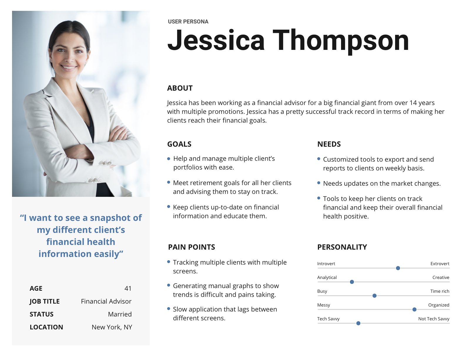
Based on the initial research and affinity mapping, I came up with 2 key persons for key users of the system advisors (who helps clients) and normal users (who use the application to track their financial health). Understanding the user’s goals and pain points helped us to improve our roadmap for the application moving forward.
You can find the sample user personas that I created for the website below.
Information Architecture and Sitemap
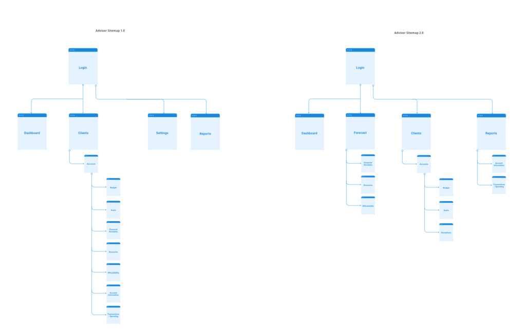
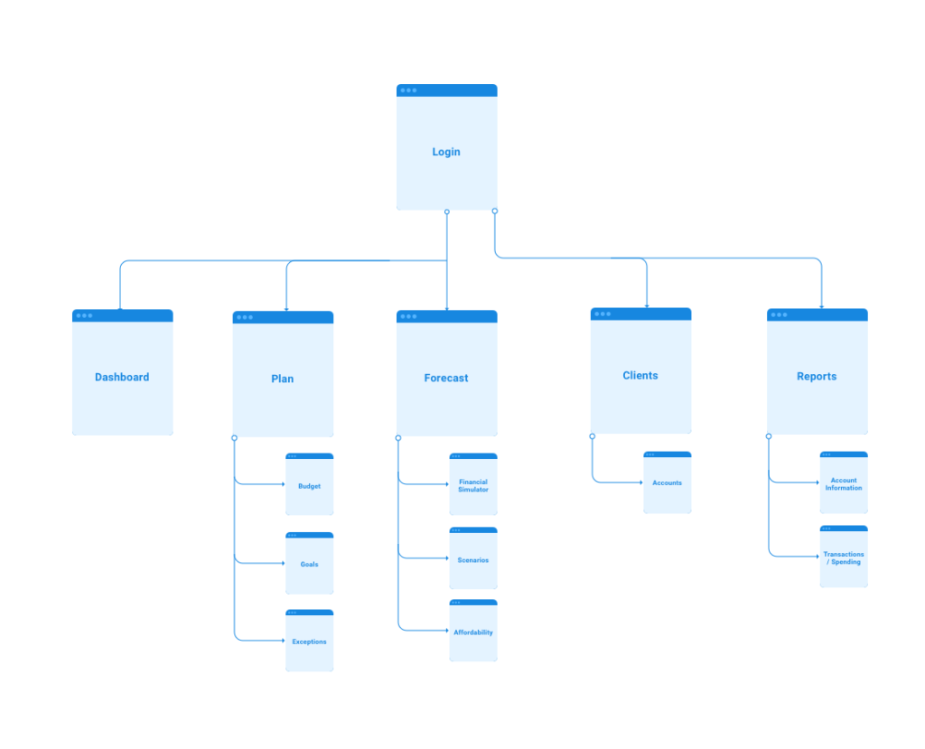
Open card sorting sessions were performed with a group of users using an optimal sort tool. Using the information from the research phase and card sorting sessions, I began carving up the taxonomies for the navigational items of the application and started arranging them in terms of hierarchy for the users.
We went through two to three rounds of iterations to come up with an optimal sitemap for both user-facing and advisor facing applications.
You can view all the iterations of the sitemaps for the application below.
User Flows
Key feature are selected and mapped to the sitemap. I worked on the user flows for those key features to make sure the steps users are taking in order to achieve a specific goal or perform a specific task is going smooth without any hiccups.
Based on the insights from the user interviews, we identified user onboarding is one of the important steps and the user wants it to as intuitive and as simple as possible. That was one of the first user flows that I focused my efforts and optimized.
Next, I moved on to user flow for the advisor dashboard. One of the complex things in the advisor dashboard is how the advisor accesses his client’s financial information. Does the advisor have to select a client first or is the feature and within the feature does he select a particular? This was one of the important features that we have many brainstorming sessions and finally came up with an optimal solution that the majority of advisors thought was straight-forward and easy to work with during their workflow.
You can view the sample user flows that I designed for the application below.

Ideation
Using the application structure and user flows, I started sketching few screens for application. Initial sketch contained essential features that users and advisors requested. I started visualizing data choosing the appropriate graph types for showing the trends and data in a more consumable way for the users and advisors without overwhelming them with too many details at the same time.
Here are some of the initial sketches of the screens from the ideation phase.

Wireframes
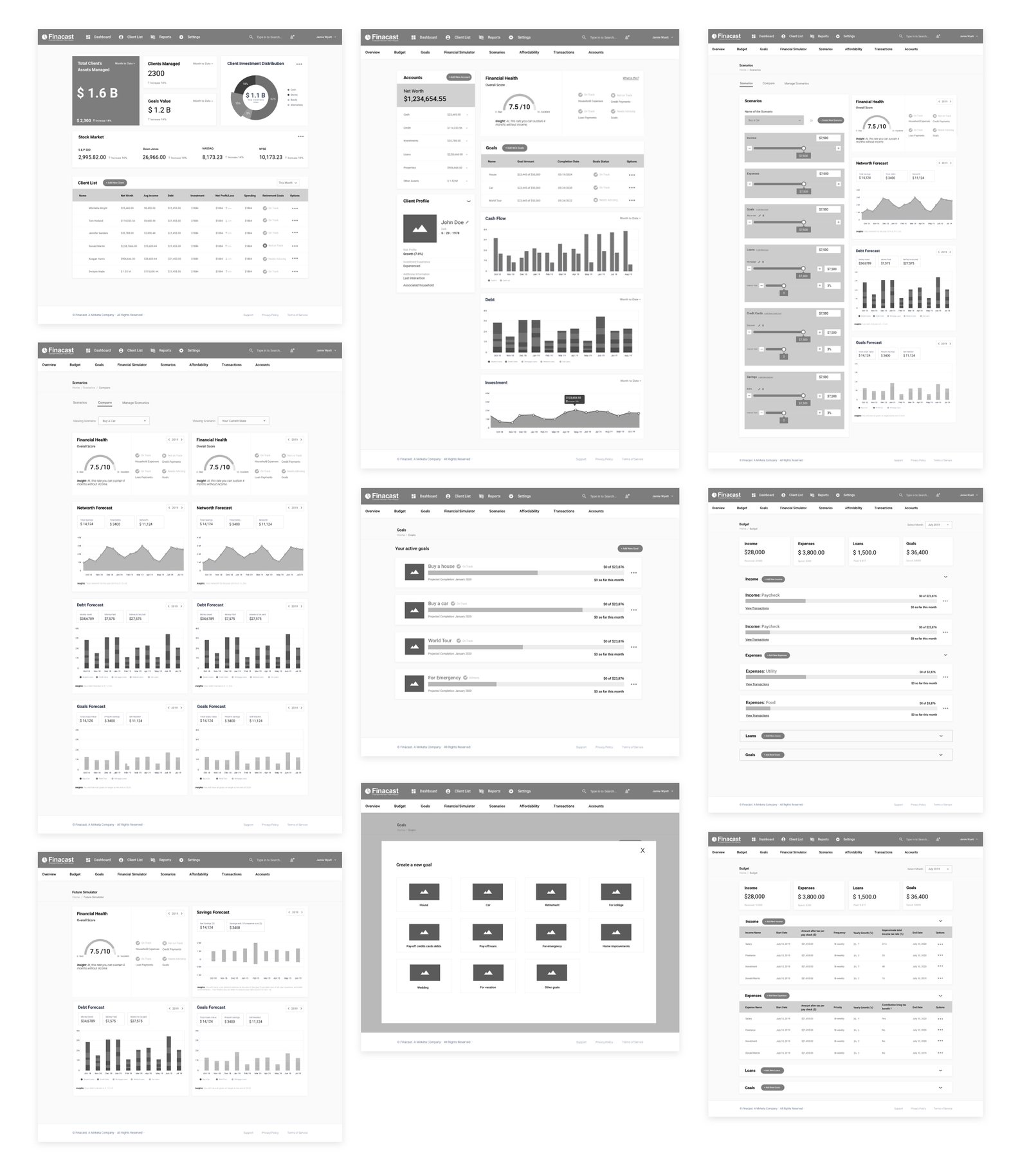
Once the initial ideas were in place, I began to give the sketches more form and meaning through wireframes. Wireframes helped me to overcome gaps during the ideation phase and gave the sketch a near-completion look which was ready for the stakeholders to take an initial stab at them and give their feedback.
Sample wireframes for the application can be seen below.
Visual Design
Before jumping into visual design, I prepared a style guide for the entire application. The style consists of the type of fonts, different colors, button styles (different states), iconography, and sample graphs. Having a style guide helps to keep all the various UI elements throughout the application to be consistent. These colors have been tested for accessibility and have passed contrast tests.
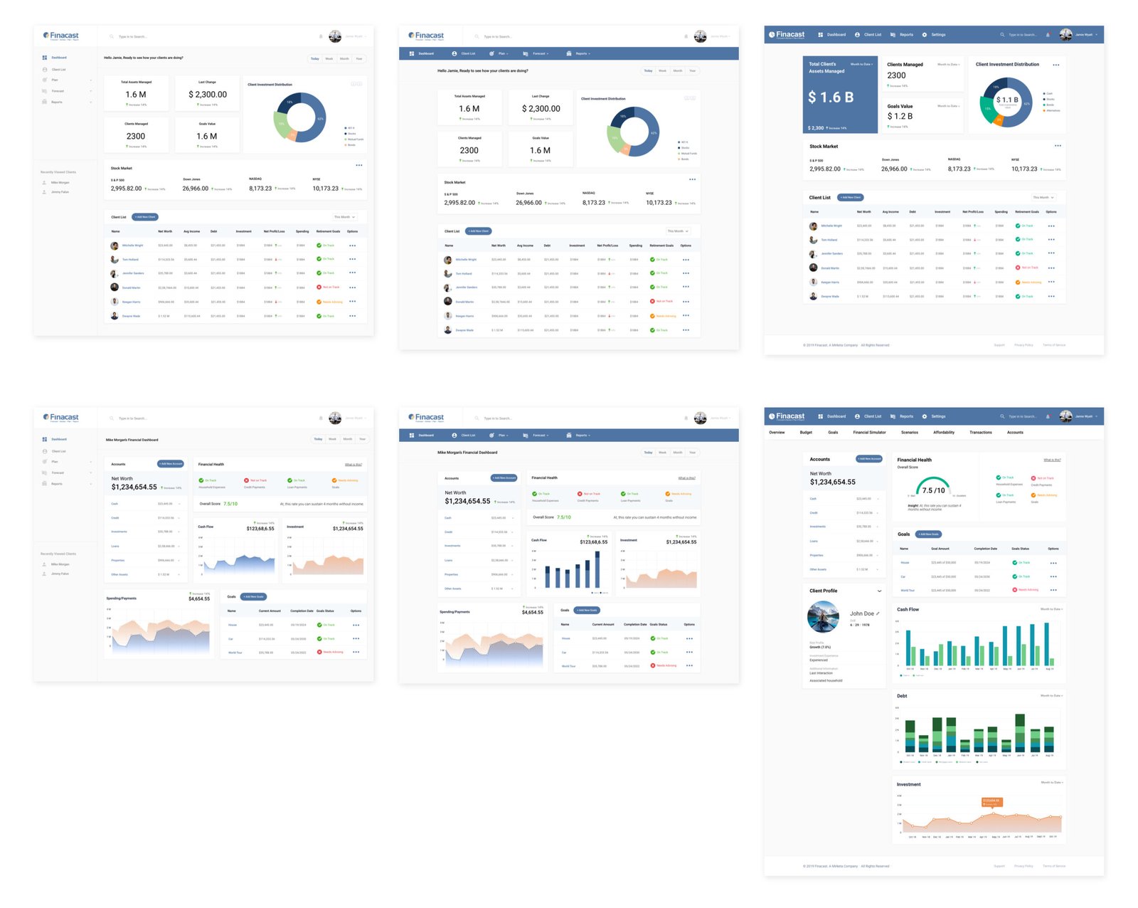
The fidelity mockups were completed based on the style guide. Clients and stakeholders were excited to see their vision and ideas come to life. We went through deep internal discussion on the look and feel of the applications and made changes accordingly.
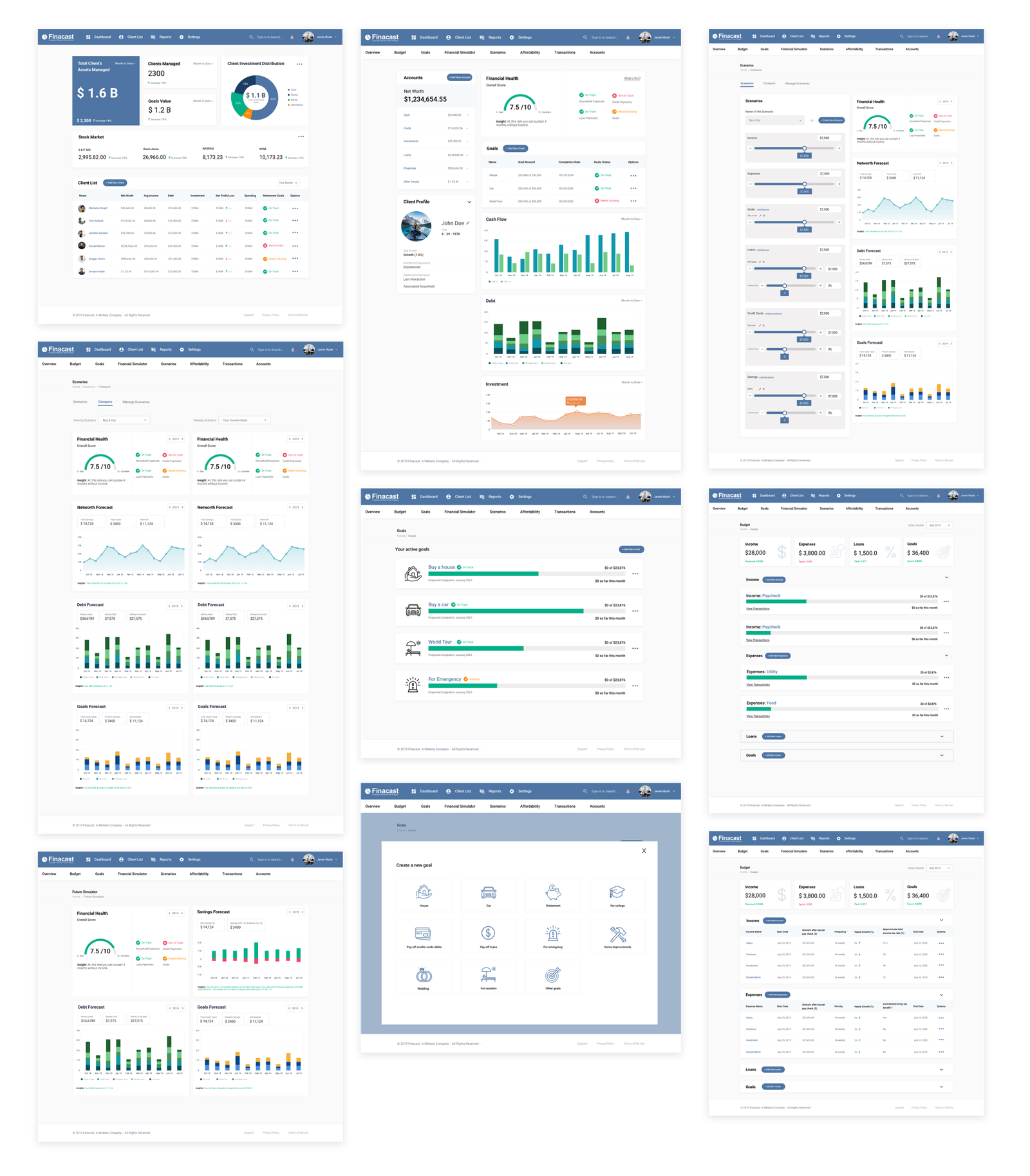
Some of the key screens can be seen below.
Advisor dashboard consists of the value of total assets is managing, client investment distribution, real-time market information, list of his clients, and their financial goals and retirement status.
User dashboard consists of a snapshot of user’s overall net worth, user’s overall financial health and status indicators for expenses goals, etc., their cash flow, and a way to track the trend of their investments.
Users can set up goals, save money towards that goal, and keep track of their goals. Setting up a goal is the straightforward user can select from the list of available goals, set a deadline and payment schedule, and save it. They can visit the goals section of the app to see the newly created goal and keep track of it. They can consult the advisor if they need some advice regarding their goals.
Usability Testing
I conducted remote usability tests for the internally approved designs. The findings the usability tests are below:

What Went Well:
— Advisors and users liked what they saw on screens. They complimented the clean easy to ready data on the dashboards.
— Easy to navigate navigational experience.
— Goal creation process was easy and fast.
— Setting up budgets and tracking it.
What Could Be Improved:
— Graph sizes need to be bigger on the user dashboard.
— Improve information hierarchy on the advisor dashboard.
— Saving simulation scenarios.
— Add more visual cues to affordability analysis.
Project Outcome
The stakeholders and the client were really happy with the design output and they are in the process of completing the development and launching the product soon to the public. One thing that I would like to change about this project is to conduct more user interviews and perform extensive user testing on the final designs. Due to budget constraints, we were not able to talk to as many users as I would have like to. It’s been a great learning experience working on this project. Especially, learning about the different facets of the financial tech industry.
