Introduction
Lizell furniture was a premier furniture store with their business operations in United States main serving areas in each coast. Lizell provides solution-oriented furniture catering to commercial institutions, healthcare and home office markets.
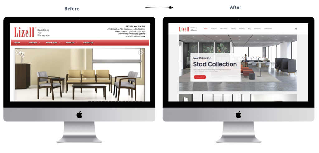
Lizell wanted to redesign their exiting website. Lizell wanted a simple easy to use website for people looking to buy furniture. They wanted an image heavy site that can showcase their furniture offerings and products in a visually appealing manner. They wanted to make the furniture buying experience as seamless as possible.

My Role
I worked as a sole UX/UI designer for the project. I conducted initial user research, improved the existing sitemap, worked on the wireframes and the visual design for the website.
Understanding the Problem
Lizell’s exiting website is not responsive and is dated (both in terms of look and functionality). It has multiple issues with cross-browser compatibility and with the way it looks on the new devices in the market.
Despite their big name in area, their existing site has numerous issues like reduction no of visits, increased bounce rate and a low conversion rate.
It is time for the complete overhaul of their existing website.
Defining Goals for New Website
The main goals for the new website are:
— Increasing the website traffic.
— Reduce the bounce rate and improve the conversion rate.
— Make the website functional on any device and browser.
— Single product page showing their features and important information about the product.
— Improved navigation to navigate through the website and locate the product easily.
— Establish trust and credibility for the customers through the new website.
— Visually communicate their offerings and products through images.
— Make it easy for the client to update the inventory and the content of the website.
Jumpstarting Research
User Interviews
I started the research process with user interviews and simple online surveys. User interviews were conducted with people from their target audience from different domains (education, workspace and healthcare) they serve.
12 people responded to the survey. The online survey contained similar questions to user interview sessions about user behavior, expectations, and pain points with the existing website.
The interview yielded many new and value insights for the new website. Some of the key insights are:

Competitor Analysis
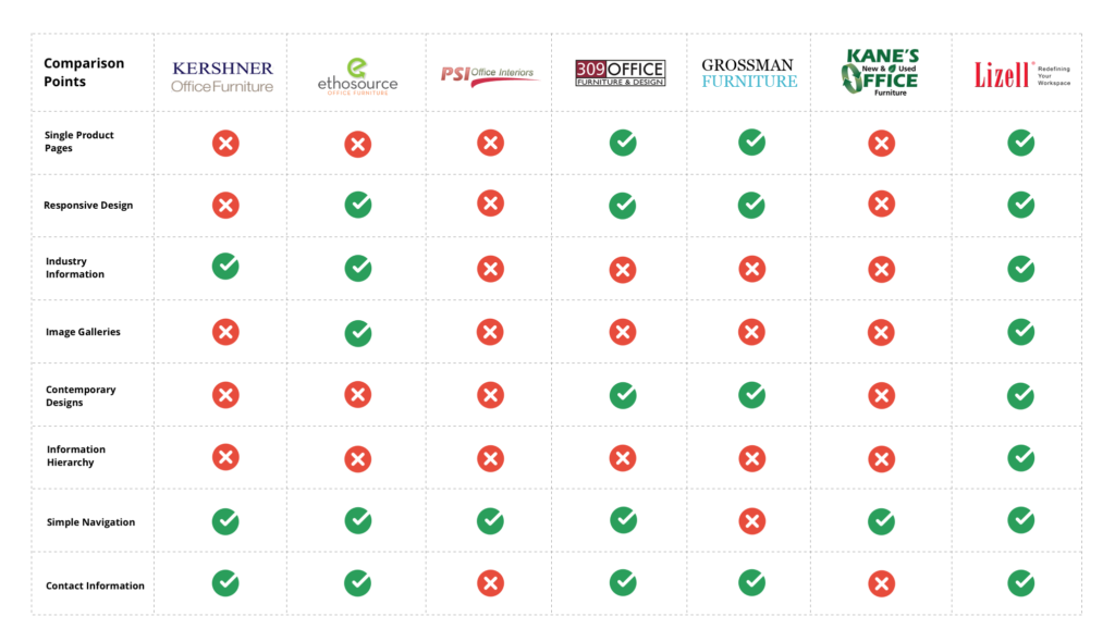
I have decided to conduct a competitor analysis to identify common themes among these competitors that could help us with the new Lizell website. I identified 6 primary direct competitors (Kershner Office Furniture, Ethosource, PSI Office Interiors, 309 Office Furniture & Design, Grossman Furniture, Kane’s Office Furniture) that serve the Philadelphia area and the east coast. Competitor analysis provided many helpful insights about the information organization, page layouts the websites are using, various features they are offering, the technology they are using, and suitable information that the new Lizell website can use as a differentiator factor.
Results from the competitor analysis can be seen on the side.
Research Synthesis
After completing the initial user research, I moved on to converting the raw information into consumable insights for the system. For this, I used various techniques such as affinity mapping, user personas, storyboarding, and MVP creation.
Affinity Mapping
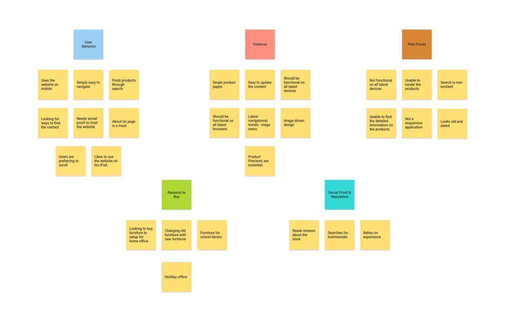
Using the information from the previous research phases, I conducted affinity mapping to draw the patterns/common themes among all the raw information users and stakeholder gave during the interviews and during other phases of the project.
Some of the common themes identified during the affinity mapping are:
— User behavior
— New features for the website
— Pain points with the existing website
— Reasons the users visit the website
— Social Proof & Reputation
These patterns helped me to organize my ideas for the website and how to come up with a solution that align both business and user goals.
You can find the affinity mapping graphic with the trends in the image below.
User Personas
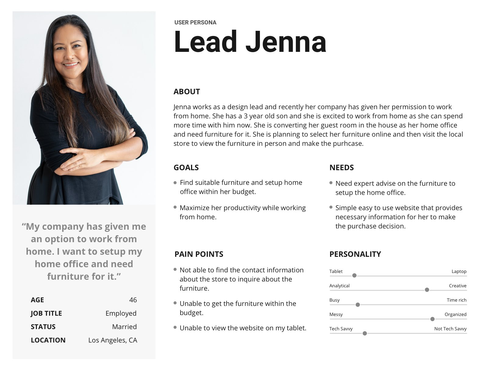
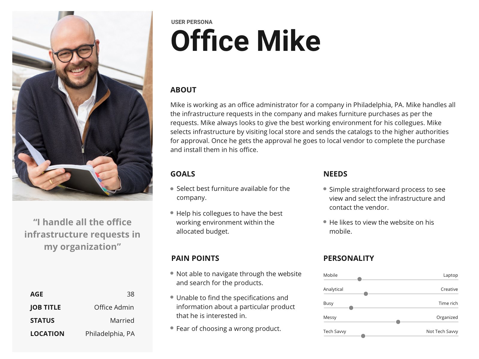
Based on the target audience groups, I created 2 user personas one for home office user and another for user for corporate environment where they buy furniture in bulk. The user personas addressed important aspects like specific user needs, goals, and pain points that are identified during the user discoveries. These personas put in a detailed context helped me to build a better road map for the website and the next steps moving forward.
You can find the sample user personas that I created for the website below.
Information Architecture and Sitemap
The next step of the process was to come up with a site structure for the website. A clear structure is really essential for the site since it has around 100 products. A clear structure is needed for users to navigate and access the information easily.
Open card sorting was performed with 6 participants using 112 cards. Users were asked to group the cards based on their perception and intuition. Once the cards we grouped, I asked them to give that group a name which helped me to come up with the category names. Using the site structure and depending on the hierarchy of the elements organized during the card sorting sessions I came up with site navigational elements. The taxonomy was reviewed with the client and after two iterations it got approved.
Final sitemap for the website can be seen below.

User Flows
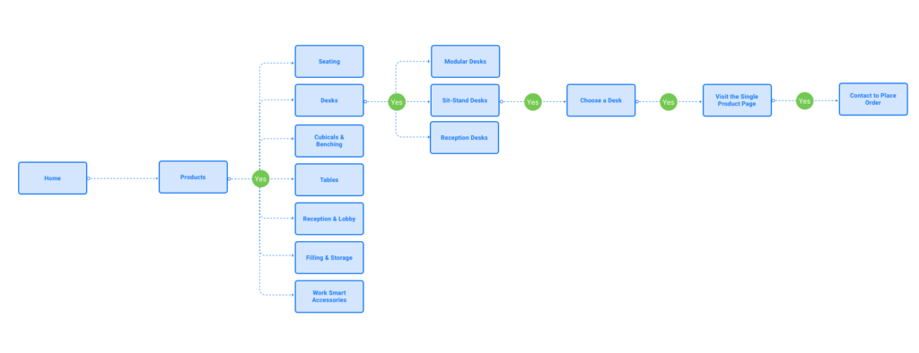
Once the site structure is in place, next I moved to creating user flows. I designed user flows for most important tasks (browsing the website, selecting a product, contacting the client once the user finalized a product etc) identified by the stakeholder and the user during the process. I used user personas as examples for executing the user flows. How the users in user personas access and navigate the website based on their needs (selecting furniture for home office and order furniture for the office).
These user flows helped me to create a simple yet effective way for the users to perform their tasks on the website without any roadblocks or dead ends.
Sample user flows that I created for the website can be seen below.
Ideation
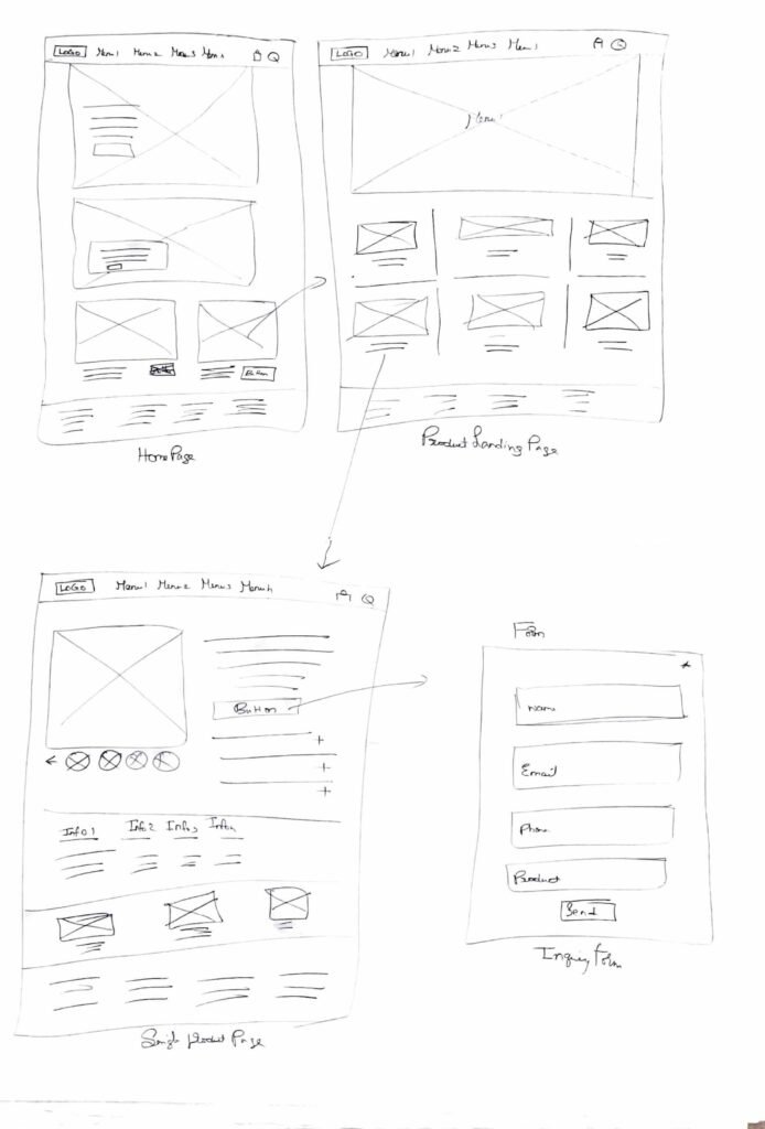
Using the sitemap and the user flows, I began sketching the layouts of the key pages of the website. Sketching helped me to explore different ways of organizing the content into their fits and aligning both user goals and business goals.
We had an internal discussion with the team on the sketches and modified the sketches based on the feedback and finalized the direction for the designs.
These sketches worked as a basis for the wireframes during the next steps of the design process.
Sketches from the ideation phase can be seen below.
Wireframes
Using the finalized sketches, I started working on the wireframes for the key web pages. Wireframes gave more form to the user journeys and user flows. They helped us to visualize and arrange the skeletal structure of the web page in a more concrete manner. This helped the clients to understand the functionality and the page structure.
I reviewed the wireframes with the client and presented how the information organized in the wireframes will impact and work for them on their journey to achieve the goals once the website is launched.
Based on the feedback from the client, I made changes to the home page blocks, introduced a new facet home offices section on to the home page. COVID-19 changed the conventional way of working taking the work from offices to home. As a result the client was more focused on pushing the home offices section on the website and drive the sales for those products.
Approved wireframes for the key pages can be seen below.

Visual Design
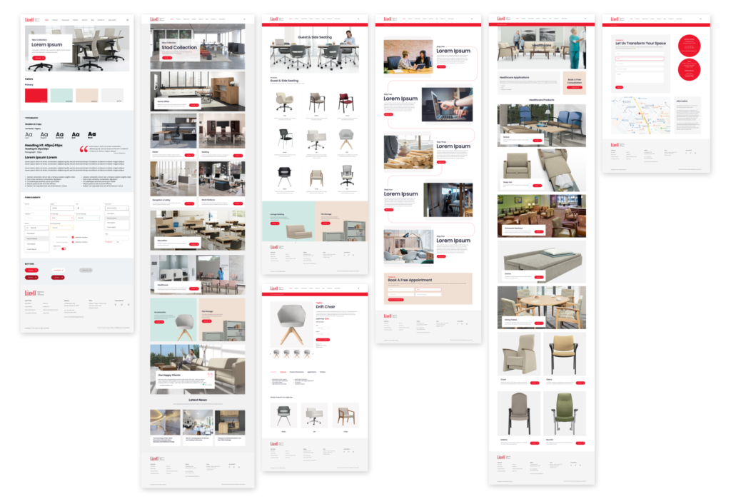
Next, I moved on to high fidelity mockups for the website with an increased level of detail for the web pages like images, fonts, colors, and the necessary visual elements and cues. Before starting on the visual design, I created a style guide for the website with sample colors, fonts, buttons, and form style, and sample UI elements. This style guide was presented to the client for their feedback on the choices. We went with the Poppins font which has a traditional and contemporary look and the client was happy with the style guide.
Once the style guide was approved, I started working on the visual design of the key web pages. Using concrete structures from the approved wireframes, I added the visual elements to the web pages and brought the website to life.
I have decided to use a megamenu structure for the navigation as they have many product categories and sub-categories.
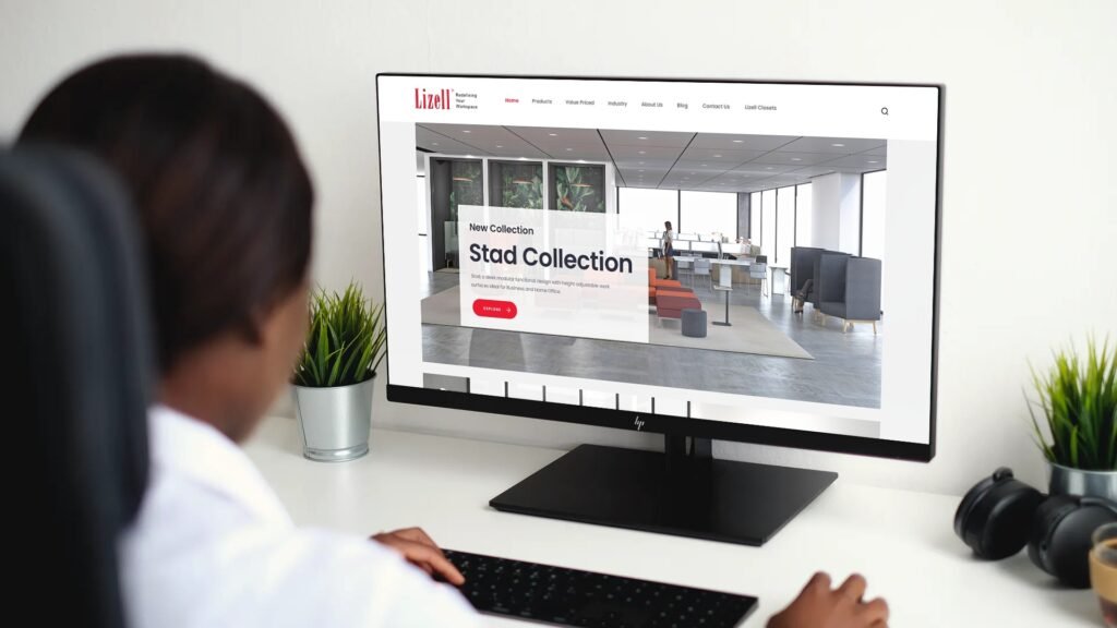
Once the designs are completed, I created a clickable Invision prototype and shared it with the client for their feedback. These mockups show the client the detail and gave them a better view of what the live website’s UI might look like.
The client was excited to see their new website and I received positive feedback on the website designs.

Usability Testing
After getting approval on the designs, I have decided to test the website internally and with real users to see what was working and what was not working. I tested the designs with 5 potential users of the website using task analysis. I gave users 5 tasks to complete.
What Went Well:
— Navigating through the website.
— Finding a specific product and contacting Lizell about it.
— Full page search functionality.
What Could Be Improved:
— Footer appears little crowded and needs some spacing between the elements.
— Reduce the amount of copy on the boxed structures and simply the structure.
— Blog sidebar needs some spacing between the grouped elements.
Project Outcome
I worked with the developers to get the website to life and to ensure the developed pages and elements are according to the approved designs and specifications. We used Zeplin as a hand-off tool between the design and the development teams.
The newly developed website gained lot of new traffic and increased the form submissions by 300% creating new leads and product enquiry.
Overall, it has been a great leading experience working on the project and learning about the nuances of the furniture industry and it’s facets.
